Edit your navigation menus
Control the links in your header and footer so customers can find their way around your store.
Your navigation menus are the links that help customers find their way around your store. You control what appears in your header (at the top) and footer (at the bottom) — getting them right makes your store feel easy to shop.
Header vs. footer
Your store has two menus, and they serve different jobs:
- Header menu sits at the top of every page and is the first thing customers reach for. Keep it short and focused on what people come to shop for — your main categories and collections.
- Footer menu sits at the bottom and is where shoppers look for the "supporting" links — policies, contact details, your About page, and the like.
Tip: A header with too many links overwhelms shoppers and pushes the important ones out of sight on mobile. As a rule of thumb, aim for a handful of clear header links and let the footer hold the rest.
What you can link to
A menu link can point to almost anything in your store:
| Link type | Good for |
|---|---|
| Product | Featuring a single hero product or bestseller |
| Category | Sending shoppers to a whole group of products, like "Shoes" |
| Collection | A curated set, like "New arrivals" or "Sale" |
| Page | Standalone pages such as About, Contact, or FAQ |
| External website | A link that opens another site, such as a partner or social profile |
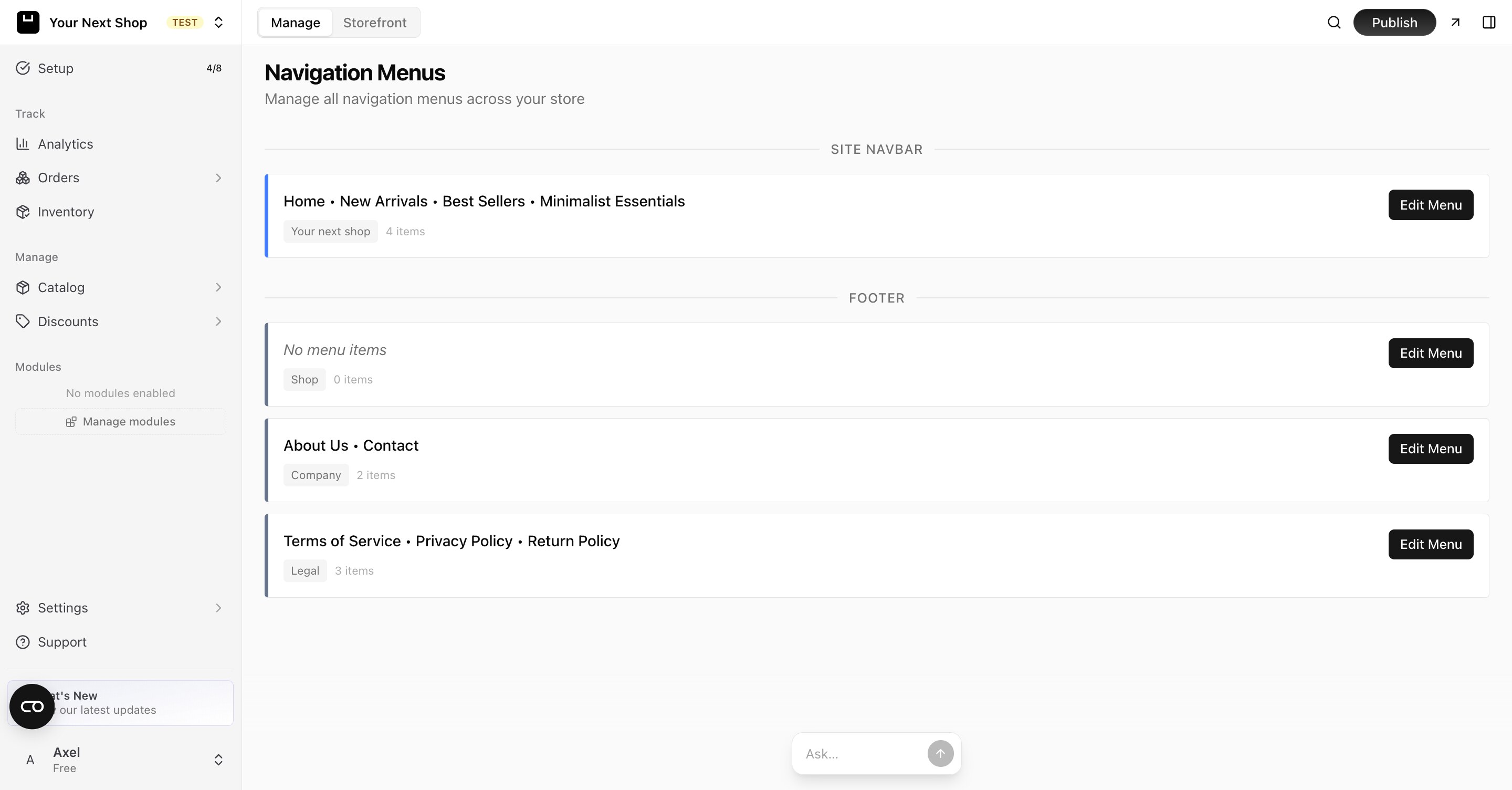
Step 1: Open your menus
Go to the navigation settings in your dashboard. You'll see your header menu and your footer menu, which you can edit separately.
Step 2: Add a link
- Choose the menu you want to edit.
- Add a new link.
- Give it a clear label customers will understand, such as "Shop" or "About us".
- Choose where it points — a product, category, collection, page, or external URL.
- Save.
Tip: Write labels the way a customer would think, not the way you do internally. "New arrivals" beats "SS25 drop", and "Contact us" beats "Support".
Step 3: Arrange the order
Rearrange your links so the most important ones come first. The order you set is the order customers see, reading left to right in the header and top to bottom in the footer. Put your best-selling categories first and the everyday "help" links toward the end.
Best practices
- Lead with shopping. Your header should answer "what can I buy here?" within the first one or two links.
- Mirror your catalog. Link to the same categories and collections you actually merchandise, so customers find a full page of products rather than a dead end.
- Keep labels short. One or two words read more cleanly, especially on a phone.
- Don't duplicate everything. A link doesn't need to appear in both the header and footer — choose the spot where customers will look for it.
- Check it on mobile. Most of your visitors shop on a phone, where a long header collapses into a menu. Fewer, clearer links shine here.
Common mistakes to avoid
- Linking to a page that doesn't exist yet. Create the page first — see Add pages and content — then add it to a menu.
- Cramming the header. If shoppers have to hunt, they leave. Move secondary links to the footer.
- Forgetting policy links. Customers expect to find your refund, privacy, and terms links in the footer. See Legal pages.
Tip: Do it with AI — you can also reshape your menus by chatting with the AI design builder. Try "add an About link to my footer" or "put the Sale collection first in my header menu", and it makes the change for you.
FAQ
How many links should I put in my header?
There's no hard rule, but fewer is usually better — a handful of clear links keeps your header tidy and easy to scan, especially on mobile. Use the footer for everything else.
Can a menu link open another website?
Yes. Choose the external website option and paste in the address. This is handy for linking to a partner site or a profile that lives outside your store.
Why doesn't my new page appear as a link?
Adding a page doesn't automatically add it to a menu. Create the page first, then come back here and add a link that points to it. See Add pages and content.
Will my menu look right on phones?
Yes — your store adapts your menus for smaller screens automatically. Because most shoppers are on mobile, it's still worth keeping your header short so nothing important gets buried.
What's next
- Create pages to link to in Add pages and content.
- Organize products in Categories and collections.
- Reshape your whole layout with the AI design builder.