The average ecommerce store loses 70.22% of its carts at checkout. On mobile that number jumps to around 80%. Most checkout optimization advice tells you to add trust badges and shorten forms, then moves on. This guide treats checkout abandonment as the architecture problem it actually is, and walks through the five root causes, the five-layer optimization stack, and the platform decision that makes most of those problems disappear by default.
📋
The short version, in priority order:
- Show every cost (shipping, tax, fees) before the final step. Single largest cause of abandonment, free to fix.
- Default to guest checkout. Cut form fields. Use browser autofill. Cuts the next-largest chunk.
- Use a hosted or embedded checkout from Stripe, Shop Pay, or PayPal. Trust + security + wallets in one move.
- Make the checkout sub-second on mobile, with no domain redirect. Mobile is 73% of traffic.
- Send abandoned-cart emails — but only after fixing 1–4. Otherwise you're reminding people why they left.
Skip to the practical 30-minute audit if you want to start with what's broken on your store right now.
What Ecommerce Checkout Optimization Actually Is
Ecommerce checkout optimization is the systematic reduction of friction between "I want to buy this" and "money in your account." It is not a single trick. It is the compounded effect of removing every reason a paying customer might bail.
Baymard Institute aggregates 50 separate studies on cart abandonment going back to 2006, and their headline number has barely moved: roughly seven out of every ten checkouts fail. Baymard estimates the lost revenue at $260 billion across the US and EU, and calls it "recoverable through better checkout UX."
The recoverable part is what matters. Baymard's testing on large ecommerce sites shows the average store can lift its checkout conversion rate by 35.26% just by fixing what's already broken. That is not a marketing number. That is the median lift across hundreds of audits.
So why do most checkouts still fail? Because the optimization advice on the internet treats symptoms, not causes.
Why Most Checkout Optimization Advice Fails
Search "ecommerce checkout optimization" and you will get the same fifteen tips: shorten your forms, add trust badges, offer guest checkout, show progress indicators, support multiple payment methods. All correct. All necessary. None sufficient.
The problem is that those tips assume your platform lets you implement them cleanly. On most platforms, it does not.
- You want a one-page checkout, but your theme ships with three steps and the alternative is a paid app.
- You want Apple Pay above the fold, but your checkout page is a server-rendered redirect to a different domain that loads its own assets from scratch.
- You want guest checkout, but your platform forces an account on the order confirmation page anyway.
- You want to test removing a field, but the field is hard-coded into your platform's checkout flow.
Surface fixes assume you have control. Most merchants don't. The leverage isn't in the fifteenth tip. It's in choosing a checkout architecture where the fifteen tips are already true by default.
That's the framing this guide uses. We'll cover the root causes first, then the layered stack that addresses them, then the architectural decision that determines how many of those layers you actually have to build yourself.
The Five Root Causes of Checkout Abandonment
Baymard Institute surveyed 4,384 US adults and asked: "Why did you abandon your last cart?" Excluding "just browsing" (43% of cases), the remaining reasons cluster into five categories that account for the vast majority of recoverable abandonment.
| Cause | % of abandoners | What's actually happening |
|---|
| Extra costs revealed at checkout | 39–48% | Shipping, taxes, and fees show up at the last step |
| Forced account creation | 19–26% | "Create an account to continue" with no guest option |
| Checkout too long or complicated | 18–22% | More than 5 steps or 12 form fields |
| Trust concerns at payment | 18–25% | Unfamiliar checkout page, no security signals |
| Total cost not shown upfront | 17% | No subtotal, shipping estimate, or tax preview before checkout |
Note what's missing from this list: button color, font choice, "buy now" copy, and most of what conversion-rate-optimization Twitter argues about. The actual money is in cost transparency, account friction, length, and trust. Get those four right and you have already addressed roughly 80% of recoverable abandonment.
That gives us our framework.
The Checkout Optimization Stack
Think of checkout optimization as five layers, each addressing a specific class of friction. Each layer compounds the next: trust signals don't matter if your checkout is too long, and a one-page checkout doesn't help if shipping costs surprise the customer at the end.

Layer 1: Visibility (cost transparency)
This is the highest-impact, lowest-effort layer. The single biggest reason for abandonment is "extra costs were too high," and what shoppers actually mean is "extra costs were too high and I didn't know about them until step 4."
The fix is to show the total cost as early as possible:
- Display estimated shipping on the product page (not just the cart)
- Show tax in the cart, not only at checkout
- Use a visible "free shipping over $X" threshold and update it live as the cart changes
- If you charge for shipping, never make it a surprise
Stripe's own checkout research puts transparent pricing at the top of the list of checkout fixes. It costs nothing to implement and removes the largest single category of abandonment.
Baymard's industry-wide checkout flow data found the average ecommerce checkout has 5.1 steps and 11.3 form fields. Most of those fields are unnecessary. Their analysis suggests a 20–60% reduction in form elements is possible without losing any required data.
Concrete actions:
- Default to guest checkout. 63% of shoppers will abandon if they can't check out as a guest.
- Combine fields. Use a single full-name field instead of first/last. Auto-derive city and state from postal code. Skip "Address Line 2" unless asked.
- Use browser autofill. Add the right
autocomplete attributes (given-name, street-address, postal-code, cc-number) so Chrome and Safari can fill the form in one tap.
- Validate inline, not on submit. Don't make the customer hit "place order" to find out the postal code is wrong.
Layer 3: Trust (payment-step anxiety)
Trust anxiety peaks at the moment a customer types their card number. 18% of abandoners cite trust as the reason; on smaller, lesser-known stores it's higher.
What works:
- Use a recognized hosted or embedded checkout (Stripe, Shop Pay, PayPal). Familiar UI does more for trust than any badge. Apple Pay and Google Pay are part of this — when a customer sees the wallet buttons they trust, they often skip the card form entirely.
- Display a real return policy and contact info linked from the checkout page itself.
- Don't fake trust badges. "Norton Secured" pixels with no actual integration are recognizable and counterproductive. Real PCI compliance is invisible. Visible "security" is usually theater.
Mobile is now around 73% of ecommerce traffic and 80% of cart abandonment. The gap between desktop conversion and mobile conversion is almost entirely a checkout-speed problem.
A 3MB checkout page on a 3G connection takes 8+ seconds to render. By the time the customer can tap "pay," they have already context-switched. Speed shows up as:
- Time to interactive at the checkout page (under 1 second is the target)
- No redirect to a separate checkout domain (each redirect adds 300–800ms)
- Mobile-optimized payment sheets (Apple Pay, Google Pay) that bypass the form entirely
We've covered the architectural side of speed in Ecommerce Site Speed Optimization: The 2026 Guide. The short version: this is not solvable with image compression. It's a platform choice.
Layer 5: Recovery (cart abandonment emails)
A small percentage of abandoners come back if you ask them to. Industry data suggests that abandoned-cart emails recover 3–6% of lost carts when sent within an hour. This is the lowest layer for a reason: it only matters if the first four layers are already in place. Sending recovery emails to people who bounced because shipping was a surprise just reminds them why they left.
If the first four layers are healthy:
- Send the first email within 60 minutes of abandonment
- Include the cart contents and a one-click "resume checkout" link
- Don't discount on the first send (you train customers to wait for it)
Mobile Checkout Is a Different Game
The desktop-to-mobile abandonment gap (66% vs 80%) is not because mobile users buy less. It's because mobile checkout is harder to design well, and most platforms ship the same checkout for both surfaces.
Three rules that matter more on mobile:
- Wallets are the primary path, not a sidekick. Apple Pay and Google Pay can complete a checkout in two taps with no typing. The card form is the fallback for shoppers without a wallet, not the default. Most platforms get this backwards.
- One column, large tap targets, real keyboards. A two-column form on a 375px screen is unusable. Inputs at least 44px tall. Number-pad keyboards for numeric fields (
inputmode="numeric"). Postal-code field that does state/city derivation server-side, not "ZIP" with no validation.
- No popups, no chat widgets, no exit-intent overlays at checkout. They eat the screen and tank conversion. The cost of a 5% upsell-popup capture rate is the cost of every other shopper who hit it and bailed.
A useful test: open your own checkout on a real phone, on cellular, with the cache cleared. If anything feels slow, sticky, or hard to tap, that's the experience 70% of your traffic is having.
One-Page vs Multi-Step Checkout: It Depends
Single-page checkout is the most-cited best practice in this category. The data is more nuanced than the advice suggests.
| Approach | When it wins |
|---|
| One-page checkout | Small carts, single shipping address, simple tax, mobile-first audiences |
| Multi-step checkout | Multi-address shipping, complex tax (B2B), fields that depend on earlier inputs (e.g., shipping method affects price) |
The case study most often quoted in BigCommerce's literature is White Stuff seeing a 37% conversion lift after moving to one-page. That's real. It's also a fashion retailer with simple carts and an existing customer base. Your store may be different.
The actual rule: minimize perceived effort, not visible steps. A two-step checkout that takes 30 seconds beats a one-page checkout that takes 90.
The Architecture Decision: Hosted vs Custom Checkout
The biggest checkout optimization decision is one most merchants never realize they're making: who owns the checkout page.
Hosted checkout (Stripe Checkout, Shop Pay, Bolt, PayPal) means the payment provider serves the page. Your customer is briefly redirected, pays, and is sent back. You give up some design control. You get back: PCI compliance, security updates, fraud detection, wallet integration, localization, and conversion optimizations that the provider runs across thousands of stores.
Custom checkout (Stripe Elements, your own forms) means you own every pixel. You also own every PCI requirement, every browser compatibility bug, every wallet integration, and every A/B test.
For 95% of stores, hosted wins. The math:
Custom checkout makes sense when you have a non-standard flow (subscriptions with usage-based billing, marketplaces with split payouts, B2B with PO-driven approval). For a normal "add to cart, pay, ship" flow, you are mostly building a worse version of what Stripe ships free.
Your Next Store: Checkout Optimization by Default
Most of this guide has been about what to optimize. The platform you build on determines how much of it you have to do yourself.
Your Next Store is a Next.js commerce platform that runs on Stripe natively. The optimization stack above is wired in by default rather than as something you configure later:

- Layer 1 (visibility): Shipping is calculated against a free-shipping threshold in the cart, not first-revealed at checkout. Tax breaks down inclusively in the order summary, not as a surprise on the final step.
- Layer 2 (friction): Guest checkout is the default. The shipping form uses a single full-name field, postal-code-to-city derivation, and inline validation through Stripe.
- Layer 3 (trust): Stripe is the payment surface. Wallet methods (Apple Pay, Google Pay, Link) render automatically when enabled in your Stripe account, so customers see UI they recognize.
- Layer 4 (speed): The storefront is built on Next.js 16 with React Server Components and Partial Prerendering. Product and cart pages load in well under a second on mobile, and checkout renders inline via Stripe's embedded payment element, with no redirect to a separate domain.
- Layer 5 (recovery): Abandoned-cart workflows use Workflow DevKit for durable, retry-safe email sends with a built-in 1-day delay between the first and follow-up notification.
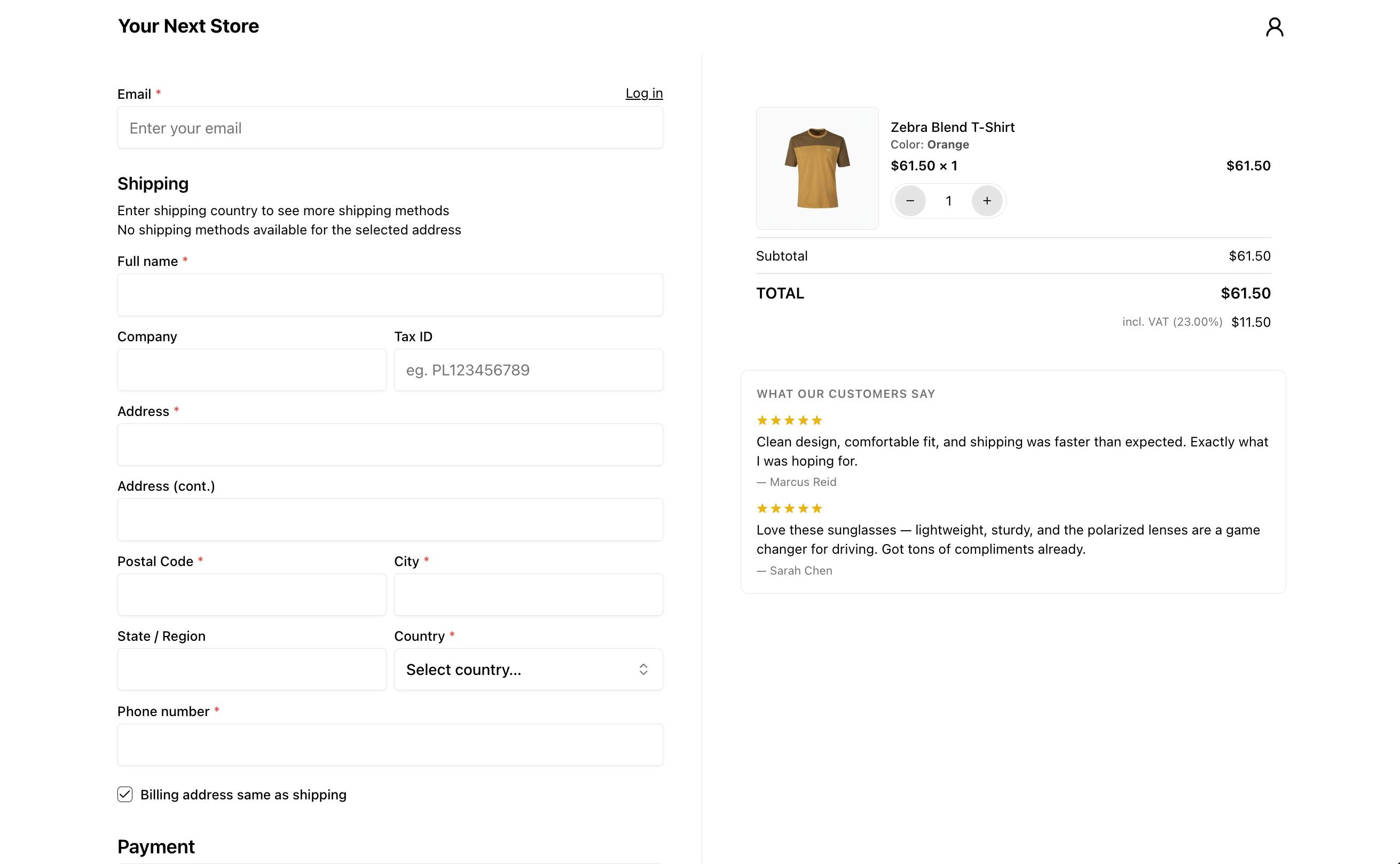
Here's the actual checkout page on a live demo store (demo.yournextstore.com). Note the single full-name field, the postal-code-to-city pair, and the tax breakdown visible in the order summary on the right. The Stripe payment element loads inline once the address is entered:
YNS doesn't try to replace Stripe's payment UI. It wraps Stripe with the catalog, cart, inventory, admin, and storefront that Stripe deliberately doesn't build, while letting Stripe own the conversion-critical surface. The full breakdown of how YNS pairs with Stripe is in How to Sell Online with Stripe in 2026.
Where YNS isn't the right fit
To keep the disclosure on this honest: YNS is built around the standard ecommerce flow (browse → cart → ship → pay → fulfill). If your store doesn't fit that shape, the case for YNS gets weaker:
- Marketplaces with split payouts (Stripe Connect Standard between sellers) — you'll want a custom build on Stripe Connect rather than YNS.
- Usage-based or metered subscription billing — YNS handles flat-recurring subscriptions, but if you need per-unit metering, Stripe Billing direct is cleaner.
- B2B with PO-driven approval workflows — YNS doesn't ship purchase-order or net-terms flows out of the box.
- Stores deeply locked into Shopify's app ecosystem — if your business depends on a specific Shopify-only app, the migration cost may not pencil out.
For everyone else (the standard add-to-cart-and-pay flow that 95% of ecommerce stores actually run), the optimization stack above is the default, not a configuration project.
Pricing: plans start at $30/month with 0% platform transaction fees. Only Stripe's standard processing fees apply. The storefront template is open source: see it on GitHub or browse a live store at demo.yournextstore.com.
A Practical Checkout Audit (Run This Today)
You can run most of this in 30 minutes:
- Open your product page on a phone, on cellular, with the cache cleared. Time the seconds from tap-to-buy to "thank you." Anything over 60 seconds is a problem.
- Add a $50 item, watch what happens to the total. Does shipping show up before checkout? Tax? Any fees? If any cost is a surprise on the final step, fix that first.
- Try to check out as a guest. If you can't, that's the second fix.
- Count the form fields. Anything over 8 is suspicious. Anything over 12 is too many.
- Look at the payment step. Are Apple Pay and Google Pay above the card form? If not, that's the third fix.
- Open analytics. What's the drop-off between "began checkout" and "purchase complete"? If it's worse than 60% conversion at that point, the issue is structural, not cosmetic.
Three fixes from that list will move the conversion rate more than a year of A/B-testing button copy. The shoppers you're losing aren't telling you why on the way out — they're just gone. The work is making the next 100 not have a reason.
FAQ
What is a good ecommerce checkout conversion rate?
For shoppers who reach the payment step, a healthy conversion rate is 60–75%. Anything below 50% indicates structural friction (forced account, surprise costs, broken mobile experience) rather than copy or design. The cart-to-purchase rate (a broader funnel) sits at around 30%, with the 70.22% abandonment being its inverse.
How much can checkout optimization actually lift revenue?
Baymard's audit data on large ecommerce sites shows a median 35% conversion rate increase from systematic checkout improvements. For a store doing $1M in annual sales, that translates to roughly $350K in recovered revenue without any change in traffic.
Is one-page checkout always better than multi-step?
No. One-page wins for simple carts and mobile audiences. Multi-step can be better for B2B, multi-shipping, or any flow where later fields depend on earlier inputs. The metric that matters is total time and perceived effort, not number of pages.
Should I build a custom checkout or use a hosted one?
For 95% of stores, hosted (Stripe Checkout, Shop Pay) wins on conversion, security, and maintenance. Custom checkout is worth it when you have a non-standard flow that hosted providers don't support: marketplaces, usage-based billing, or B2B approval workflows.
Related Blog Posts