# Product Page Design: How to Build a Page That Sells
Product page design that converts: the 8 elements every page needs, mobile rules, trust signals and a checklist you can ship today. Build yours now.
*Published 2026-11-09*
**Your product page is where every dollar of ad spend, SEO effort and email work either turns into an order or leaks away.** Good product page design is not about a prettier template. It is about answering the shopper's questions in the order they ask them: what is it, does it look right, what does it cost, will it fit, can I trust you, and what happens if it is wrong. This guide breaks the page into eight parts, shows what strong stores do, and ends with a checklist.
## What a Product Page Has to Do
A product page has one job: take someone who already half-wants the product and remove every reason not to buy. Traffic arrives with a question in its head, usually from a search result, an ad or a recommendation. If the answer is slow, vague or hidden, the shopper goes back to the results.
That makes product page design different from homepage design. A homepage persuades, a category page helps people compare, and the product page closes. Most of the decision is made in the first screen, so the structure matters more than the polish.
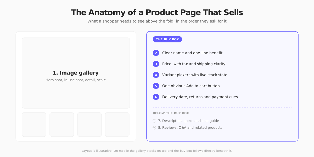
Think of the page as two zones. The gallery and the **buy box** (name, price, options, button, delivery and returns) carry the decision. Everything below it (description, specs, reviews, related products) carries the doubt-handling for people who need more convincing. Put the most important things where the thumb or the eye lands first.
## 1. Product Images That Do the Selling
Shoppers cannot touch the product, so images are the product. [Baymard Institute's product page research](https://baymard.com/blog/ecommerce-product-page-design) consistently finds that shoppers lean on images to judge fit, scale and quality, and that weak or missing image types cause hesitation.
A gallery that works usually has:
- **A clean hero shot** on a plain background that matches what marketplaces and Google Shopping expect.
- **An in-use shot** that shows scale, context and how it looks on a body or in a room.
- **Detail shots** of materials, stitching, ports or labels, the things people zoom in on.
- **Variant-specific images**, so choosing a color changes the photos, not just a swatch.
- **Short video or a 360 view** where movement matters (bags, furniture, gadgets).
Glossier's Cloud Paint page is a good example. The gallery leads with a person wearing the product, because the question for makeup is "what will this look like on skin", not "what does the tube look like".

Keep images fast. Your hero image is almost always the largest element on screen, so it drives Largest Contentful Paint. Serve modern formats at the right size, preload the first image and lazy-load the rest. Our [photography guide](/blog/ecommerce-product-photography) covers shooting, and the [speed optimization guide](/blog/ecommerce-website-speed-optimization) covers delivery.
## 2. Name, Subtitle and Hierarchy
The title should say what the product is in plain words, with the variant detail shoppers search for. "Cloud Paint" plus the line "Seamless cheek color" works because the second line explains what the first cannot. Put a one-line benefit directly under the name rather than burying it in a paragraph.
Typography does a lot of the work here. Use a clear size order: name, price, button, then everything else. If two things on the screen look equally important, the shopper has to decide which to read, and that is friction.
## 3. Price, and What the Price Really Is
Show the price near the name in large, readable type. Then answer the questions that make the number feel safe:
- **Is tax included?** In the EU and UK, shoppers expect prices to include VAT. In the US and Canada, sales tax is normally added at checkout, so say that shipping and tax are calculated later.
- **What is the shipping cost or threshold?** A "free over $100" line beside the price beats a surprise at checkout. Unexpected extra costs are one of the most cited reasons for [cart abandonment](/blog/how-to-reduce-cart-abandonment).
- **Is there a discount?** If you show a crossed-out price to EU shoppers, the lowest price in the previous 30 days is regulated. See our [Omnibus Directive guide](/blog/omnibus-directive-pricing).
- **Can I pay over time?** Showing an installment amount, as Glossier does with Afterpay, reframes a $24 purchase as four small ones. Our [buy now, pay later guide](/blog/buy-now-pay-later-ecommerce) covers when that pays off.
## 4. Variants, Options and Stock
Size and color pickers are where many sales die quietly. A shopper who is unsure of their size will leave rather than guess.
- **Pre-select a sensible default**, or make the "select an option" state obvious, so the add-to-cart button never fails without explaining why.
- **Show availability per option.** Cross out or label sold-out sizes instead of letting people select them and discover it later. Offer "notify me" for those.
- **Use swatches for color and buttons for size**, not dropdowns, which hide the choices.
- **Link to a size guide** at the point of choice, and add fit notes such as "runs small" gathered from reviews and returns.
- **Update everything when the variant changes**: images, price, SKU and stock message.
Allbirds shows the pattern well. Sold-out sizes are crossed out, the add-to-cart button stays disabled with a "Select a size" label until a size is picked, and a fit note sits right under the size row.

Honest scarcity helps. "Only 3 left" is useful when it is true and harmful when it is invented. Fake urgency also invites trouble under consumer law in several markets.
## 5. The Add to Cart Button
This is the one element that must never be missed. Make it the highest-contrast element in the buy box, label it with a verb ("Add to cart", "Add to bag"), and keep it in the first screen on both desktop and mobile.
Rules that rarely fail:
- **One primary action.** Secondary actions (wishlist, compare, subscribe) should look quieter.
- **Instant feedback.** Confirm the add with a drawer or mini-cart, and show a way to continue shopping or check out. A button that seems to do nothing gets pressed twice.
- **A sticky button on mobile**, so the action is always one thumb-tap away after the shopper scrolls to read reviews.
- **A clear path to checkout.** The product page ends where [checkout](/blog/ecommerce-checkout-optimization) begins, so keep the handoff short.
Express payment buttons (Apple Pay, Google Pay, Shop Pay, PayPal) on the product page can skip the cart entirely for returning customers. They are worth testing, particularly for low-consideration products.
## 6. Delivery, Returns and Trust Cues
Doubt, not desire, is what usually stops the purchase at this stage. The best product pages deal with it right next to the button.
- **A delivery estimate**, ideally a date, not "3 to 5 business days". See our [shipping strategy guide](/blog/ecommerce-shipping-strategy).
- **A returns summary** in one line ("30-day free returns"), linking to the full [return policy](/blog/ecommerce-return-policy). Clear returns reduce the fear of a wrong choice.
- **Payment and security cues**: accepted payment methods and a recognizable checkout provider.
- **Real contact options**, such as chat or an email address, particularly for higher-priced products.
Apple's product pages show how far this can go. The price is framed as a monthly amount, trade-in credit and carrier deals sit above the fold, and a chat assistant is a click away. It is a lot for a small store to copy, but the principle scales down: put the financing, delivery and help answers where the buy decision happens.

## 7. Description, Specs and Content Below the Fold
Not every shopper reads the description, but the ones who do are your most careful buyers. Write for them and for scanning.
- **Lead with the benefit**, then the details. Our guide to [writing product descriptions](/blog/how-to-write-product-descriptions) goes deeper, and [AI can draft them](/blog/ai-product-descriptions) when you have a large catalog, as long as you edit the output.
- **Use bullets and a spec table** for dimensions, materials, compatibility and care. Tables are also easy for search engines and AI assistants to read.
- **Answer the common questions** (what is in the box, is it dishwasher safe, does it work with X) in a short FAQ.
- **Use accordions** for long content so the page stays short, but do not hide key information such as materials or sizing.
If you sell in the EU, product pages can also carry legal information such as the price per unit for some goods and energy labels for appliances. Check what applies to your category.
## 8. Reviews, Social Proof and Related Products
Reviews are the strongest trust signal you have, so show the star rating and review count near the title, then the full reviews lower down. Make them useful:
- **Show the distribution**, not just the average. A 4.6 with a few harsh reviews reads as real.
- **Let shoppers filter** by size, skin type or use case.
- **Include photos from customers.** They answer fit and color questions better than any copy.
- **Keep negative reviews.** A page with only five-star ratings looks curated, and in many jurisdictions suppressing genuine reviews or faking them is a consumer-law issue.
- **Mark them up as structured data** so search results can show stars. See our guide to [product schema markup](/blog/product-schema-markup).
Under the reviews, add related products or "complete the look" bundles. Do it after the main decision, not before, so you do not pull attention away from the buy box.
## Mobile Product Page Design
Most ecommerce traffic is now on phones, and the product page is where mobile conversion is usually won or lost. Design it first for a 390-pixel screen, then expand.
- **Gallery first, buy box immediately after.** A swipeable carousel with a visible position indicator works better than a wall of stacked photos.
- **Sticky add to cart** with the price and selected variant.
- **Tap targets of at least 44 pixels**, with space between size buttons.
- **No horizontal scrolling and no popups** that cover the product. Email popups that open before the shopper has seen the shoe are a common cause of instant exits.
- **Autofill and wallet payments** so no one types a card number on a phone keyboard.
## Speed Is Part of the Design
A slow product page is a badly designed one. Aim to pass Google's [Core Web Vitals thresholds](https://web.dev/articles/lcp), where a Largest Contentful Paint of 2.5 seconds or less counts as good. On a product page, that mostly means:
- Optimize and correctly size the hero image, and prioritize it.
- Render the buy box on the server so price and button appear immediately.
- Load reviews, recommendations and chat widgets after the main content.
- Reserve space for images and badges so the layout does not jump.
Frameworks with server components and partial prerendering make this easier. See [how Your Next Store stays fast](/blog/how-is-your-next-store-so-fast).
## How to Test and Improve Your Product Pages
Do not redesign from opinion. Use data:
1. **Find the weak pages.** Look at product views to add-to-cart rate by page and device in your analytics. Compare against your [ecommerce KPIs](/blog/ecommerce-kpis).
2. **Watch real sessions.** Session recordings and heatmaps show where people stop scrolling or tap things that are not buttons.
3. **Read returns and support tickets.** Each "it was smaller than I expected" is a missing size cue on the page.
4. **Test one change at a time**, such as moving delivery info next to the button. You need enough traffic for the result to mean anything, so low-traffic stores are better off applying best practice than running tests.
## Product Page Design on Your Next Store
If you would rather not build the template from scratch, [Your Next Store](https://yournextstore.com/) gives you a Next.js storefront with product pages, variants, collections and a cart already wired to a managed commerce backend. Our AI builder lets you restyle the page by describing what you want, and the [open-source storefront](https://github.com/yournextstore/yournextstore) is there if you would rather change the code yourself. Product pages are rendered with React Server Components, which keeps the buy box fast.

Whatever platform you use, the order is the same: fix the images and the buy box first, then trust cues, then content below the fold. Most stores get more from the first two than from any redesign.
## Product Page Design Checklist
Before you publish, check that your page has:
- [ ] At least four useful images, with variant-specific photos
- [ ] A plain-language product name and a one-line benefit
- [ ] A visible price with tax and shipping clarity for the markets you serve
- [ ] Variant pickers that show stock per option
- [ ] A high-contrast Add to cart button visible without scrolling, sticky on mobile
- [ ] A delivery estimate and a one-line returns summary near the button
- [ ] Scannable description, spec table and short FAQ
- [ ] Real reviews with a rating shown near the title
- [ ] Product structured data that matches what is on the page
- [ ] A Largest Contentful Paint under 2.5 seconds on mobile
## FAQ
### What makes a good product page design?
A good product page answers the shopper's questions in order: what it is, what it looks like, the price, which option to pick, whether to trust the seller and what happens if it is wrong. It does this with clear hierarchy, strong images, one obvious button and visible delivery and returns information.
### How many product images should an ecommerce page have?
There is no magic number, but most pages work well with four to eight: a hero shot, one or two in-use shots, detail shots and variant-specific images. Add video if movement matters. Quality and variety matter more than count.
### What should be above the fold on a product page?
The main image, the product name, the price, variant options and the Add to cart button. Add delivery and returns cues next to the button where there is room. On mobile, aim to have the gallery and the start of the buy box on the first screen.
### How long should a product description be?
As long as it takes to answer real questions, and no longer. A short benefit-led summary, a bulleted feature list and a spec table cover most products. Complex or expensive items justify more detail.
## Related Blog Posts
- [Ecommerce Checkout Optimization: The 2026 Playbook](/blog/ecommerce-checkout-optimization)
- [How to Write Product Descriptions That Sell (and Rank)](/blog/how-to-write-product-descriptions)
- [Ecommerce Product Photography on a Budget (DIY Guide)](/blog/ecommerce-product-photography)
- [How to Reduce Cart Abandonment: Fixes That Actually Work](/blog/how-to-reduce-cart-abandonment)
- [Ecommerce Website Speed Optimization: The 2026 Guide](/blog/ecommerce-website-speed-optimization)